The previous Tecnomaco brand was already the result of an initial restyling operation, in which the use of squares making up the T was replaced by the harmony of rounds, with a consequent change of font. But after so many years we opted for a radical change, redefining the visual identity of our company, to communicate new intentions and to consolidate our positioning within the pharmaceutical and nutraceutical industry.
The design of the new logo was commissioned to the Growell agency, which as of this year has become our partner of choice for corporate communications.
In the brief we provided we expressed a few, but significant requirements:
- Synthesis
- Solidity
- Innovation
- Global vision
After a series of versions and a discussion with our management, the agency arrived at a creative solution that was compelling and in line with our conceptual requirements.
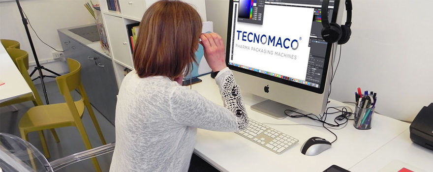
With this article we are therefore launching the new Tecnomaco logo, which represents the synthesis of what we have been and, above all, what we will be.
The design
The design elements that characterise the logo are undoubtedly the oblique cuts, which affect some of the letters in the wording, and which reappear in the two Os, which are in fact cut into two semicircles. The precision that emerges is in line with what engineers and industrial designers put into our designs. The same precision is evident in each of our machines when they have to count, fill, dose, seal and label.
Another element is legibility. We have abandoned the pictogram, except for iconographic requirements: personalization of social profiles, branding of images and little else. In short, TECNOMACO will always be read in full; we didn’t want frills or distractions, but a real logotype where character customization is the essence of the project.
Choice of colours
We talked about precision and the dominant colour could only be represented by blue. A decisive, deep, functional and institutional blue, which leaves no room for misunderstanding: 100% cyan, 60% magenta and 30% black.
In support of the colour with which we identify the genesis of our machines, the starting point: steel grey. We can say it: blue and grey are an indissoluble pairing in the industrial environment, too strong not to consider, too right not to choose it.
The choice of typeface
The Gotham font, used in the medium version, is contemporary, linear and well-defined. It has ‘character’, like our company, and lent itself well to the designer’s customization.
The payoff
The payoff, the phrase that accompanies the brand and indicates the company’s positioning in the market, is a more incisive reworking of the phrase used in the previous brand. It conveys continuity and, at the same time, the ability to look to the future. The font used is still Gotham, but in the book version.
The capital letters give the payoff a strong identity value. This choice allows us to maintain an aesthetic coherence and, at the same time, to strongly underline the specificities of Tecnomaco within the global market.